Wednesday 24 February 2010

Collage Fun


The first day of the materials workshop was just about basic collage. We had to produce 3 pieces; a self-portrait, our hero and something we hate. This is my "something I hate" and self-portrait. The heroes (my parents) are still at uni but I'll get them up asap.

Collage Fun 2


Work from the second collage material workshop at uni. We had talks/demonstrations of monoprinting, scrafitti,carbon paper printing, etc. and were just set loose with materials which was FUUUUUNNNN. A lot of the graphics students enjoyed these last two workshops especially as it's not the kind of stuff we usually do. We had to just fill the long sheet with experiments and then do whatever we wanted. So I did a bridge joingin two cities.

Tuesday 23 February 2010

Happy Birthday Lauren!


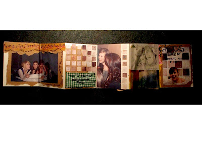
Had my bookbinding induction the other day and we got to make a little concertina book, so I decided to make mine for The Wilson as it was nearly her birthday. I love the covers, we were allowed to choose the colours! (MASSIVE EXCITEMENT!) But the best part, obviously, was the foil stamp type on the front. Mine is incredibly wonky but only because of the lack of time. Never mind, it's nice and it has a Brighton Starling on the front. I just filled the book with lovely random Lauren-related photos, pictures, private jokes, etc. It was fun, she liked it (I think).
P.S. The stitched bits are HAND-SEWN YESTHANKYOUVERYMUCH.

Valentine's Day 2010


Thought it would be fun to give a load out but I ran out of ideas after rushing 3 of them. So sorry if you weren't one of the lucky ones, you know I love you anyway.

Return to Sender


Letters I have sent. I send them for fun, I like to draw little things and write nice things and stick things on. I love the feeling of getting a letter that's not a bank statement or a bill or something boring, so I love giving other people that feeling. I wish I'd taken pictures of all the others I've sent but only thought of it when I sent these two. I've digitally smudged the text because it's none of your business.
They're all for different people, mainly Joe and Lotty at the moment.
I'll update this post as I send more letters...

Presents for People


I could have done a lot better on these, but they were little last minute ideas so had to rush. It's a reason, not an excuse ;)
These were all presents for some Christmases or Birthdays or Anniversaries, can't remember. The top one is a sketch of Joe's parents, for Joe's parents, the bottom two were for my parents. The first sketch is my brother and sister and what should be me but looks like an awful distorted freaky-eyed version. They are both younger than me, would like to clarify this due to the obvious differences in height, -I- am the older and more mature of the three, obviously. On the bottom are the legends themselves, my Mum and Dad, in acrylic. Couldn't quite get Mum's face right but maybe one day I'll try again. Or maybe I won't. They'll have to seeeeeee....

Old Art I'd Like To Keep...


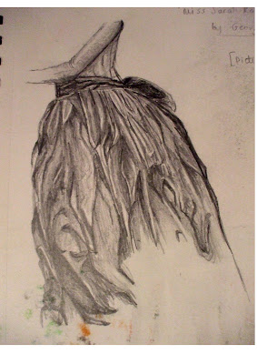
Some very old pieces from as far back as year 10 that I want to keep a record of. All from different, random projects. There's a pencil copy of a photograph, a drawing of a dress from a renaissance painting somewhere (when I was studying clothing and folds), some copies from album covers, some work from a project on smoke, including a clay statue, a cubism-style oil painting and a pencil drawing, a coloured pencil and watercolour copy of a painting in the Tate Modern and finally a very old painting from a long exposure photograph.

We all surprise ourselves sometimes.

Monday 15 February 2010

Typography poster attempt #2 - Win!


Re-working of the Building Blocks poster. Went down very well at assessment! Could do with making a few small changes, but this will do for now. I need to learn the value of empty space.

Sunday 14 February 2010

Library poster


A brief to make an A2 poster encouraging other students to use the Grand Parade Campus Library. I had many ideas and settled on this one because I was desperate to have a go at Alison Carmichael-inspired type. It was so hard to get this piece of text right, used up around 20 pages of my layout pad. But I'm happy with the finished look of the type, and satisfied enough with the rest but might re-work it at some point. The feedback was 50/50, with some stating the type was too confusing and hard to read, (which is completely understandable, I just wanted to have a go) and some arguing that that it what makes the poster good, the shapes are initially intriguing, making the viewer want to look more at the poster. So I will probably do another, more legible version, but keep this one because I'm pleased with it.